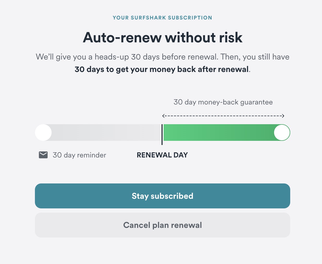
An example of a UX dark pattern used by Surfshark
2024 is not the same as 1824, but one thing that remains important is reputation.
The way you think of a company or a person changes when they trick you, doesn't it?
When it comes to UX, there is this thing called dark patterns and this is one of them that I just faced.
I want to bring your attention to the buttons while knowing that my will is to cancel auto-renewal and the purpose of the page is to let users cancel auto-renewal.
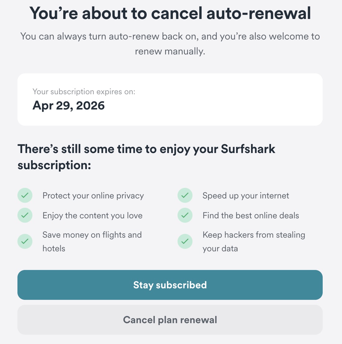
There is clearly a main and secondary button. Then, there is the labelling of the buttons. Both those elements make this a dark pattern.
Knowing the purpose of existence of this page, the main button should be the one to cancel auto-renewal.
As for the labelling, I can tell you from a web developer's point of view that auto-renewal is naught but a on/off switch. It's a very easy and simple thing to code. However, the words make it sound like it's a grand thing.
“Stay subscribed” induces the feeling that if you don't click that button, you will no longer be subscribed, even if you don't intend to unsubscribe at all.
“Cancel plan renewal”, combined with the previous label, tries to make you think clicking it will cancel your subscription.
Put everything together, this is a dark pattern and I must praise whoever came up with it. I just wish they used their powers for good instead of evil.
Everytime a company or a person tries to trick others, our opinion of them changes, sometimes a little and sometimes a lot. In this case, I was already irritated to have to contact customer support just to turn off auto-renewal.