Rebekka’s website, the design (2 of 2)
The first post I made on this subject was about everything that occurred before I started working on Rebekka’s website. This one will be about how I ended up making the website the way it is.
“if i have a site done i want it to be very simple, user friendly to the point” is what Rebekka told me.
I have heard the words “simple” and “user friendly” before. My whole life, the way I do things, the way I work, the way I interact, the way I… is all centered around “simple”. The design for my very own website does justice to that.
I have never been told “to the point” before. What that meant to me, web design-wise, is no useless flash animation with a very useful skip button. It also meant that the subject of the website should be unmistakable, even with the word “photography” no where to be found on the website.
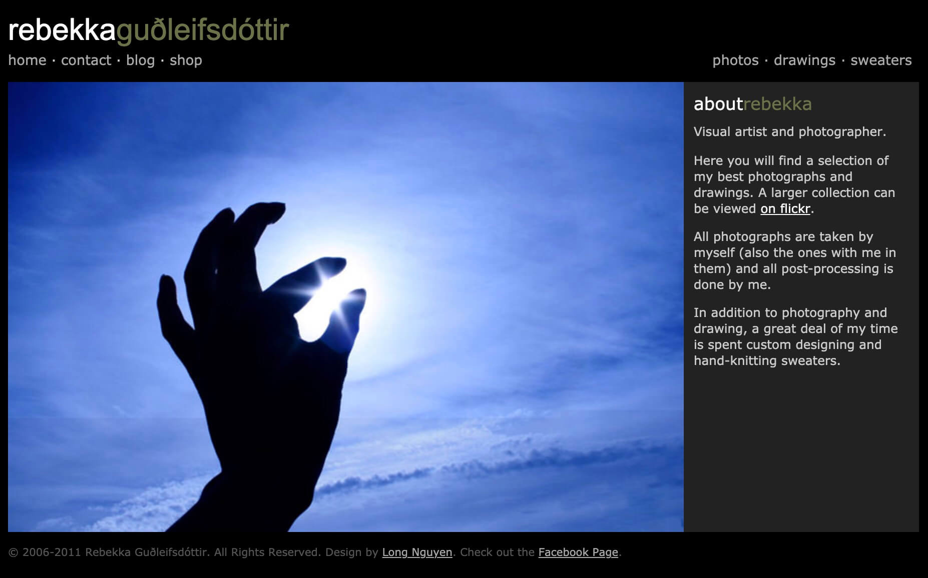
Her photos are the most important thing. I started out with one big photo and then I layed out everything else around. The quality of the photos is the only thing that matters. I wanted people to come on the website and say “nice photos” rather than “nice website”. Every single page of the website has the big area for a photo. There are no thumbnails page. By laying out things this way, I believe to have accomplished all three points (simple, user friendly and to the point) of Rebekka’s request.
“One thing i hate about my flickr page is the white background. Just not a good way to display photos.”
She didn’t like the white background on flickr, so I went to the other extreme: black background. Just as simple as that.
“i’m very pleased with the colors (the green is just perfect, that color is just me in a nutshell:p)”
The text color is gray rather than white for the simple reason that I wanted to reduce the contrast so that the photos always stand out. About the greenish color, I got it from her signature on her most favorited photo (at this time). Rebekka didn’t tell me to do it, but since she used that color for her signature, it just made sense to me to use it.
“i’m very happy with the site”
I’m also very happy with the site. If I had to describe this website in one sentence, I would say that it’s simple, user friendly and to the point.